Showing posts with label gimp. Show all posts

Saturday, September 24, 2011

Post Processing 101

prometheus-bd from flickr asked me for some tips about photos post processing, I though of posting it here so everybody could read it, even if I'm not very good at explaining stuff...

I though of starting with the basics of post processing, this is not how to take a photo, what background is best for a given subject or what composition is best for a given scene, this is meant to be a simple showcase of the tools available in imaging software and how they affect the image itself.

I will NOT be explaining how 'light room' (same process as darkroom from film times, but for processing digital RAW data) works in this entry, I leave that for another time.

I'll be using GIMP, it is a free application and give me quite some tools for enhancing my photos, I use some python Filters that I installed a long time ago, but for sake of compatibility I'll use only the most common ones than can be find on other imaging application. This is not a GIMP tutorial though, so you should know what/where tools are, names of tools don't change a lot from application to application, so this shouldn't be too troublesome.

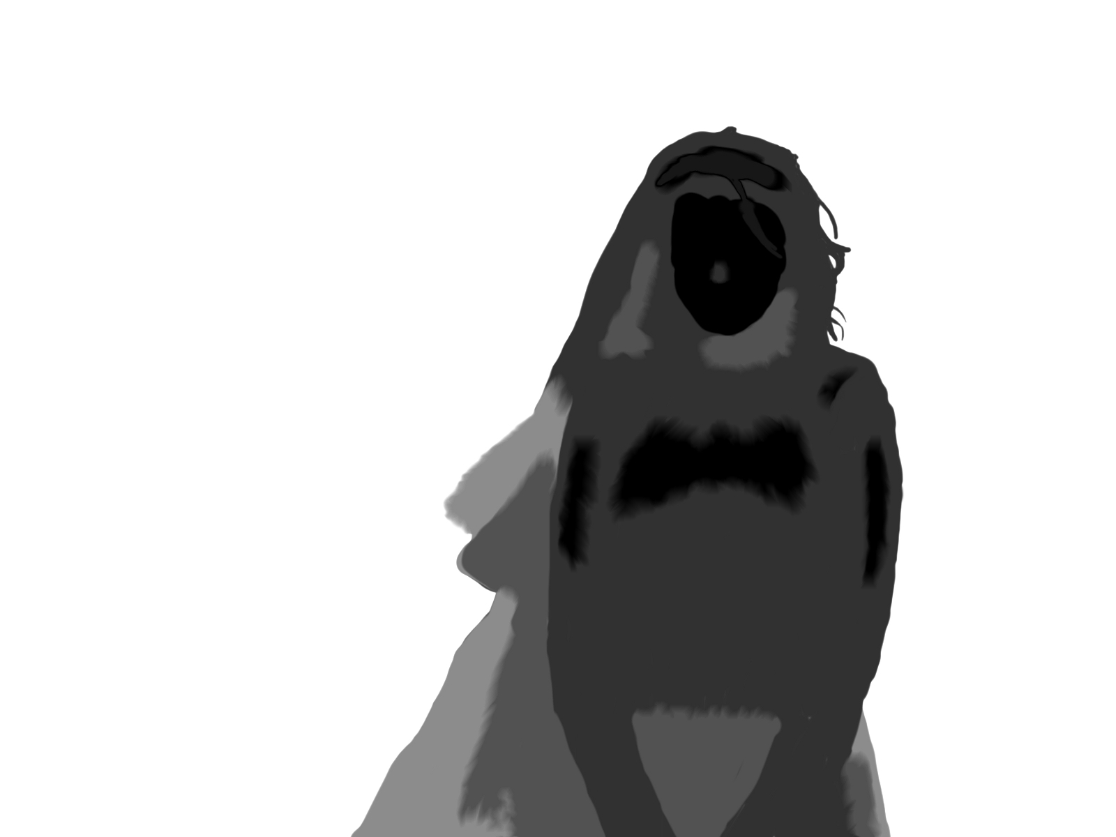
First we need to start with a photo... well ... I have a bunch of them so I'll just pick one at random.

I like this shot, while it wasn't the best taken one, it provides a nice start point to show some post processing tools.

Let's start with composing the shot... usually you should prevent this by correctly frame the photo when shooting, but sometimes, either because you didn't had the time to do it or you did not perceive the scene well, framing will not be as good as you wanted.

I feel like this shot needs to be rotated to level those stairs with the picture frame, there is a rotate tool available, it allows you to rotate the image at any degree your want. In Gimp you can also overlay guide lines by dragging the ruler bar into the image itself. You may want to expand image canvas to fit layer size.

I think I over did it a bit, well, this is only a simple tutorial with no artistic intentions.

If you want more control over the image you can use perspective tool, it may prove useful to make something into perfect rectangle/square. Like this on the right. You can also use lens distortion/correction tools, some cameras correct it already.


 I solve to crop the photo quite a bit, this can be done by making a rectangle selection and choosing "Crop to selection", in my case I set the selection to have 3:2 proportions.


At this point I feel that image needed to be sharpened a bit, I've done this using a special filter I have in GIMP, it is equivalent to unsharp mask filter in other applications with support for darkening and enlightening edges so that they 'pop up' more, giving the image those contrasty edges that are pleasant for the eyes while avoiding some artifact given by normal sharpening tools. However, over doing it will make the picture look artificial by casting auras/halos around edges in a similar fashion to what happens using normal sharpening filter. Using a large radius mask will give a bump in local contrast, if the strength of the filter is too much it may give some halos similar to those of HDR images, I feel this image could benefit from some slight improvement of local contrast, so here it goes, radius 64 with 0.5 strength.

If your application can only lighten the edges (most do, photoshop and paint shop pro should have it working like the GIMP filter by now though), you can apply the filter to the normal image, invert the colors, apply it again, and invert to the original (you can test this by drawing a light gray rectangle on a dark gray background and applying the filter).

Well, the picture has now a bit more contrast, however, in the picture the sun was setting, and it lacks the harsh light of the sunset, I wanted to enhance a bit that mood as a pretext to explain a bit the curves tool.

I applied the shown curve modifier to the image

This is probably one of the most basic curves you will use, understanding how to use curves tool requires you to understand what a image histogram is, I won't be explaining that here right now, but you can get an idea that it shows the amount of pixels at a given light level (if it is a luminance histogram).

The light gray diagonal line shown the original curve, the black line shows my change.


It gives an increase of contrast (as the slope is bigger) in the middle area

Reduces a bit the exposure (darkening the photo) as most of the curve is under the original one

Clips the shadows a bit (by starting under the original line).

A side effect of increasing the contrast is that it increases the saturation (color contrast) as well, this is because the curve is not applied to luminance alone but to Value channel, that can be seen as an average of RGB, this gives me a stronger orange/red tone on the stairs, thus increasing the idea of the sun light hitting the stairs there.

I suggest you play with the curves tool, it can be very powerful to either correct the colors, enhance them or simply create surrealistic effect.

It depends of what application you are using to edit your photos, but you can apply the curves tool not only to luminance (Y channel/Value channel), but to other components as well.... from RGB ones to HSV or HSL or even CMYK channels. Here I bumped the red channel a bit and reduced the blue channel a bit giving it more warmer tones


Hope you liked this small showcase of post processing tools.

Play with the tools you have on your application, if you are new to this and have Windows on your computer, I suggest Paint.NET as a starting point, it is free, simple and intuitive.

If you like to see something more deeply explained feel free to ask.

Have fun!

Saturday, December 11, 2010

Tablet + Windows 7 x64 = riiiiiiight!

Well... if you have a Trust, Genius, Aiptek, Nisis, etc. tablet, most likely it is made by a Taiwan company called Waltop. That I have said before on a previous entry, I also recommended taking the drivers from Waltop website (they have x86 and x64 versions), that I can still recommend, however if you're using GIMP on Windows 7 x64 (and I guess Photoshop as well, given the number of threads on several forums) you may notice that, no matter how powerful your PC is or what driver version you use, there is a annoying lag between brush strokes, like the mouse pointer is "holding a dog leash to the brush".
If you're using a Wacom Tablet you may have the same issue.
Luckily this seems to be a Windows problem (aren't you glad?), you have to disable the gestures and flicks that Windows 7 activates by default, you just go to Control Panel -> Hardware and Sound -> Pen and Touch
There, in Pen Options tab, you go to the avaliable settings for each pen action entry and disable each of them where possible, then un-check the checkboxes under Pen buttons, also, in Flicks tab, disable the flicks usage.
There .... GIMP is working :] Fun fact: Open Canvas 1.1 beta 72 revision 1 works flawlessly even if drivers don't work correctly under windows (this is true for windows XP, Vista and 7 - In XP it worked WITHOUT drivers installed) ... Now that's what i call voodoo software... :]

Monday, December 6, 2010

Artificial Bokeh

Bokeh... better use wikipedia explanation: In photography, bokeh is the blur, or the aesthetic quality of the blur, in out-of-focus areas of an image, or "the way the lens renders out-of-focus points of light." Now, this is often used to enhance a subject or give a dreamy or surreal look to a picture, in portraits is often used to achieve a smooth background, and while it's not always desired it appears because of the so called circle of confusion and depth of field (http://en.wikipedia.org/wiki/Depth_of_field).
For achieve the blur of out of focused areas one must often use lens with big apertures or/and a good focal length, and those are usually expensive, heavy, big or a combination of the three... The other way of achieve that effect is to simulate it artificially... and that it's kinda tricky, mainly because the original image to which you want to apply it doesn't have the entire information to do it....
The simplest way to increase blur or create blur to given out of focus areas would be when create miniature looking photos of a city, this is possible because cities are often layered in a simple plane and an overlayed blured picture using a gradient as mask does the trick in most of the cases....
Extending the concept, one can create a mask to protect focused areas and blur the rest, but bokeh doesn't have a regular radius blur, the bigger the distance from the focus plane is the blurrier the area looks, and that brings us to a depth map/mask ... sadly this is not easy to create, nor easy to apply as a mechanism of interpreting the depth must exist.
Taking care of a mechanism for doing it properly, i introduce you to GIMP Focus Blur Filter Plug-in (windows version)... Now how does that plug-in perform.... wonderfully i must say... sadly my 20mm f/1.7, while has a big aperture, sometimes it's not quite enough to blur the background as i wished it would do... so i searched and found this pearl... it is quite awesome to apply... the drawbacks?
I point two: It will take its time to be applied (in a 8MP image might take like 10mins!) and you really need a depth map if you want to see awesome results :]
By the way, black means focused, white means fully unfocused.... in the middle ... is in the middle :] Well, to help you out with the depth map, i'll point you to another plugin: Depth map Plugin (windows version) ... It will create a depth map, but it has a requirement: You need to take two stereoscopic images, and that on moving stuff is only possible with two cameras (preferably identical)... it works pretty well, but you might want to retouch the depth map a bit for best results... Here goes an example of what you could do (Halloween Gothic Bride for the win): The original (well, not quite original, as this was cropped, noise was reduced, color corrected, details sharpened and reduced on the end for web view): The depth map i drawn (clumsy for the win): The end result using Flat model, 25px radius blur, 5px radius shine: This is simply the best plug-in I've ever found - and i don't even explored everything it has to give - this fella is just above tone mapping filter :]

Monday, April 20, 2009

LCDs...

Hmm... you want to buy a new screen for your computer, or even for your living room, but have no idea of what to choose and how to see if it's really good that cheap one at the store in the next corner? Well, then i have something to you! Was not made by me, but you may want to see if, even if you are already happy with your current screen. LINK You don't need to be an expert to know that my laptop screen does suck, you just need to glance it, but how bad it is? The answer is 1:50 contrast ratio! ... Yes ... i have a freaking laptop with a crappy contrast ratio, sadly, i usually use it to image edition, getting somewhat shabby results because of my pour color choices... go figure! ... Well, i'm happy with my laptop, it's freaking fast beating my desktop in every point, except for the screen... well, at least i can conect it to a proper screen :p EDIT: After a few more tests, i found out i wasn't holding the camera perfectly perpendicular to the screen, since my screen viewing angles are .... bad, i was getting such values, it's not like it's much better, but the after all the testing the results i've obtained were 386:1 contrast ratio and 180cd/m2 on maximum luminance... my pda screen has 580:1 and 295cd/m2 ... one can easily see the diference just by looking at their image, oh well... Hmmm ... in other news, gimp and my new tablet went in disagreement, since only gimp gives me trouble i would guess that it's gimp's problem, but since it does detect my tablet correctly, but looses track of pressure information channel, i would say that is a less ordinal aproach in drivers implementation with some gimp implementation choices that cause trouble, oh well, at least openCanvas 1.1 beta 72 revision 1, never fails me, but it does lack some features xD. Oh, it works everytime in Adobe applications too, well, my 30days trial over photoshop are over, so i can't exacly see if it works there now... well... stuff done with my pen tablet can be found here, some stuff (like the comic with BOOM letters - lineart came from snafu-comics.com) is not entirelly done by me, but you can have fun watching stuff appear there in a random fashion...

Thursday, February 26, 2009

VGA 8bits per pixel limitation... not a real issue!

This was the most colourful image i could find in my images folder (image from VGCats.com): As you can see only the sun is a bit weired... this was using a custom 256 color pallete on gimp and simply changing color mode to index using dirthering.... Dirthering is really powerful ... I was surprised with the results i've obtained using only 256 colors, specially with only 2 bits for blue channel, i shall try applying a small image into fpga to check if the final result is really this good... who knows, perhaps a small animation XD I may upload the pallete later for the ones who wish to try :p PS: It's 12:48 ... why does blogger think it's 4:24am .... i'll never know >__>''